
Star Marketing
With the ongoing addition of new Builders to New Home Star’s client list, NHS saw a need for a dedicated in-house agency to take on Marketing work in a more efficient matter. As part of a restructuring to solve this need, Star Marketing was born. As lead designer, I had the opportunity to personally develop our new agency’s branding, rooted in extensive research and reflecting the company’s evolving needs and respective clientele.
Branding | Logo Design | Design Research

Star Marketing’s branding was developed over months of research, idea sessions, and stakeholder meetings. In order to ensure we nailed down the exact, correct direction for the new brand, I spearheaded in-depth research with our Marketing department leads. We dove into the nitty gritty of the purpose, intended goals, target audience, and more of this new branch. This research alone took up multiple weeks, all before I even picked up a pencil and really began to ideate.



Once we finalized things like brand archetypes and who exactly we were going to be targeting, I created 3 different “brandscapes” to aid in narrowing down our ideal branding approach.
The 3 approaches in order of appearance were as follows:
1. Emphasis on craftsmanship and elegance
2. Emphasis on bold creativity that feels fun and supremely human
3. Emphasis on a light playfulness, with digital-minded design.
The winner was #3 - something that places emphasis on the digital side, while still maintaining a very human-touched, almost whimsical feel. Pushing these pieces even further, we expanded and sharpened the brandscape to get final buy-in prior to beginning ideation for the actual branding itself. Some of the changes made were: Dropping the gradients, as they felt a little too trendy. Pushing the playfulness even further, to capture whimsy. Adding a sneak peek into how this would look in the type selection, brand colors, and icons, and how that might come together on the website.

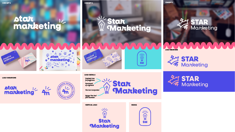
Now that the brand discovery has been completed, it was time to begin concepting the logo system. I struggled with this stage, as I felt a bit boxed in by the fact we already decided on branding and typography, so it was difficult to break out of using the typeface we selected and pairing an icon alongside it. In fact, I did try this method initially, as I really did love the font and thought it could shine through even more within the logo. However, I knew this was not really the direction I wanted to go in - nor was it resonating with the rest of the team.
With a push from the Creative Director to dive deeper and break free from the typeface, I went back to the drawing board - a physical one, at that. I do my best work starting with a pencil, so why should this be any different?
My usual process for logo creation is to start with paper and pencil, then move over to Adobe Fresco on my iPad to sharpen up lines while keeping everything vectorized. Final cleaning and pixel pushing happens in Illustrator.
While this process is a bit more time-consuming, I believe it pays off when the goal is to create something that feels more handmade. In my opinion, without already owning a bunch of textural brushes and other vector assets in Illustrator, getting that handmade feel is just significantly harder when concepting right within Illustrator. That was part of my initial problem, as well - wanting to use the brand typeface led to self-imposed digital confinement.
After a lot of failed ideas, I found a winner: a hand-drawn word mark.