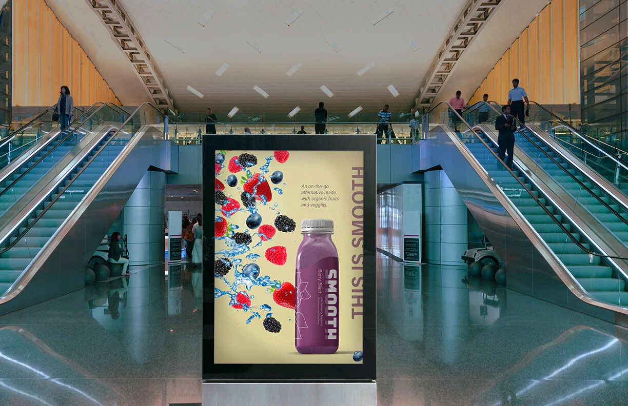
Smooth
Designed with health-inclined millennials in mind, Smooth is a rebrand created to challenge yet live alongside the smoothie brands on the current market.
Created with a partner.
Branding | Packaging Design | Print & Digital


Case Study
Assignment: Develop a brand identity for a new drink company on the market.
Seeing firsthand the growing popularity of homemade smoothies as well as the rise of trendy pressed juice companies, my partner and I decided to revamp smoothie branding in a way that capitalizes on these trends.
Goals: To stand out as a modern beverage that active millennials would want to purchase.
Tactic: Situate our brand alongside current smoothie brands while borrowing the aesthetic of trendy juice companies.
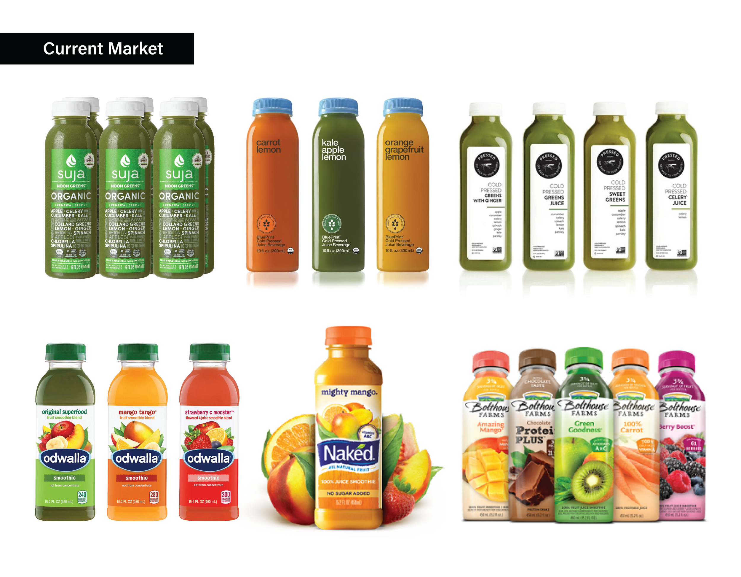
Research
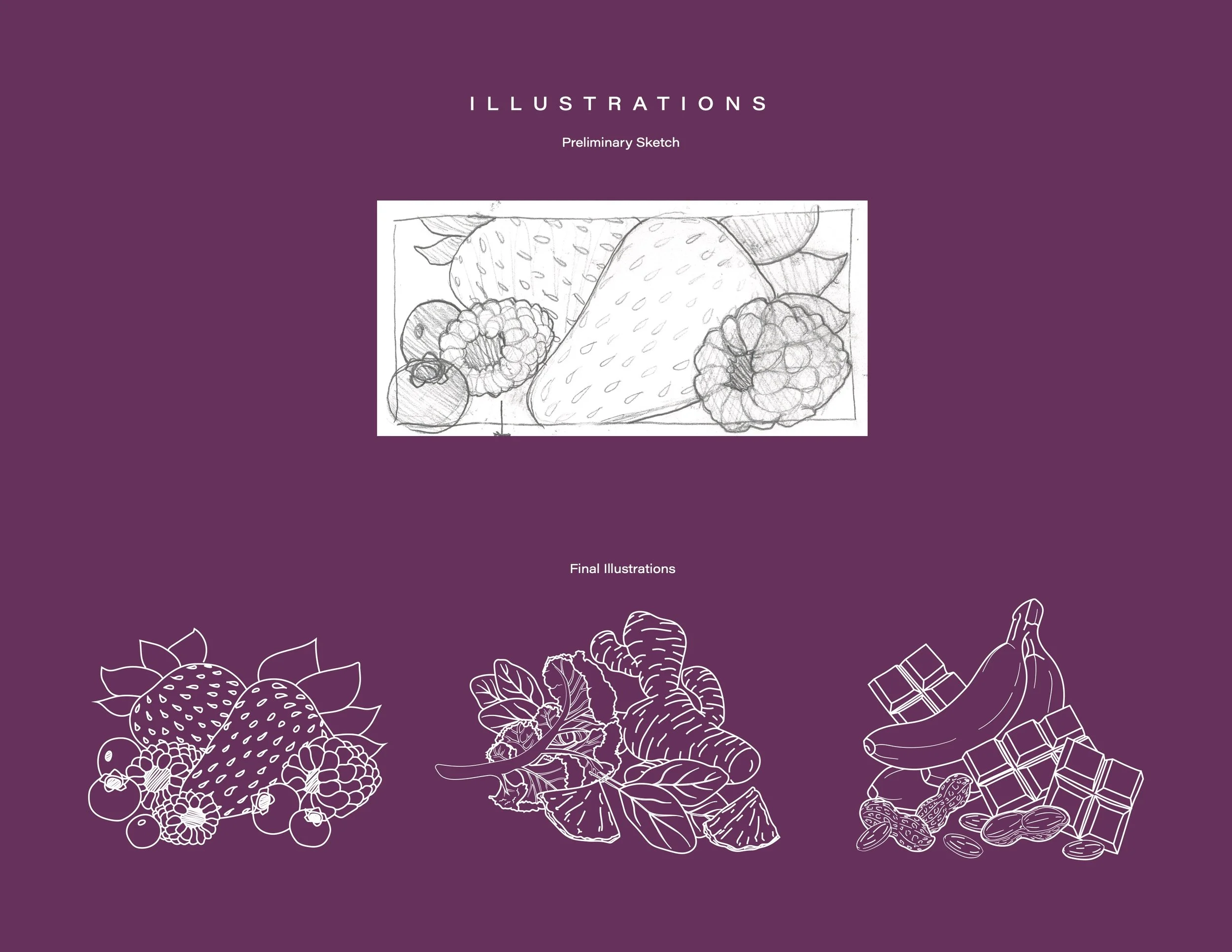
After studying the current market, we found that many popular smoothie brands rely heavily on imagery as their selling point. However, we wanted to do this with a more modernized approach. As a result, we landed on using illustrations as a happy medium between classic and modern.
Initial exploration
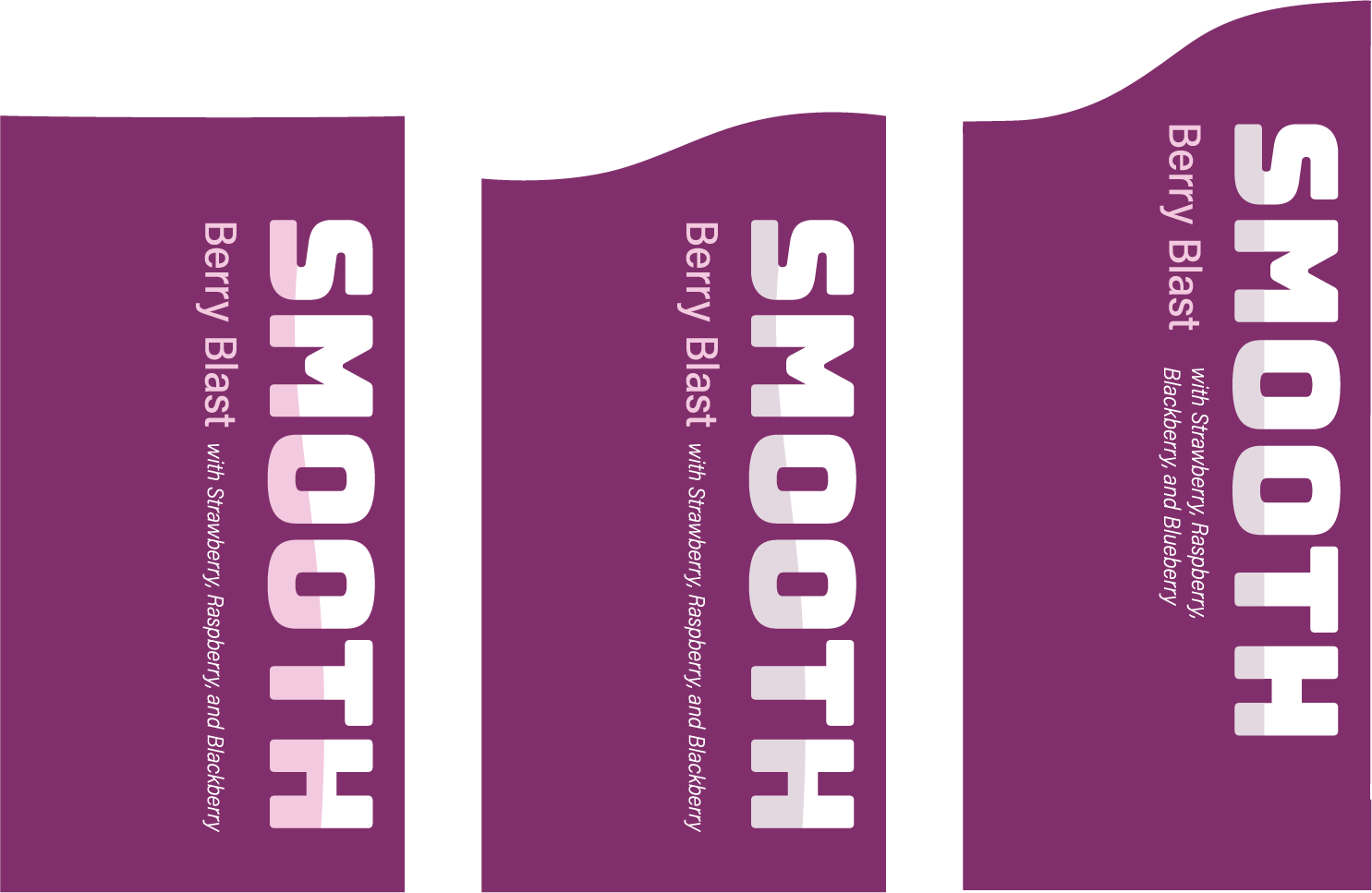
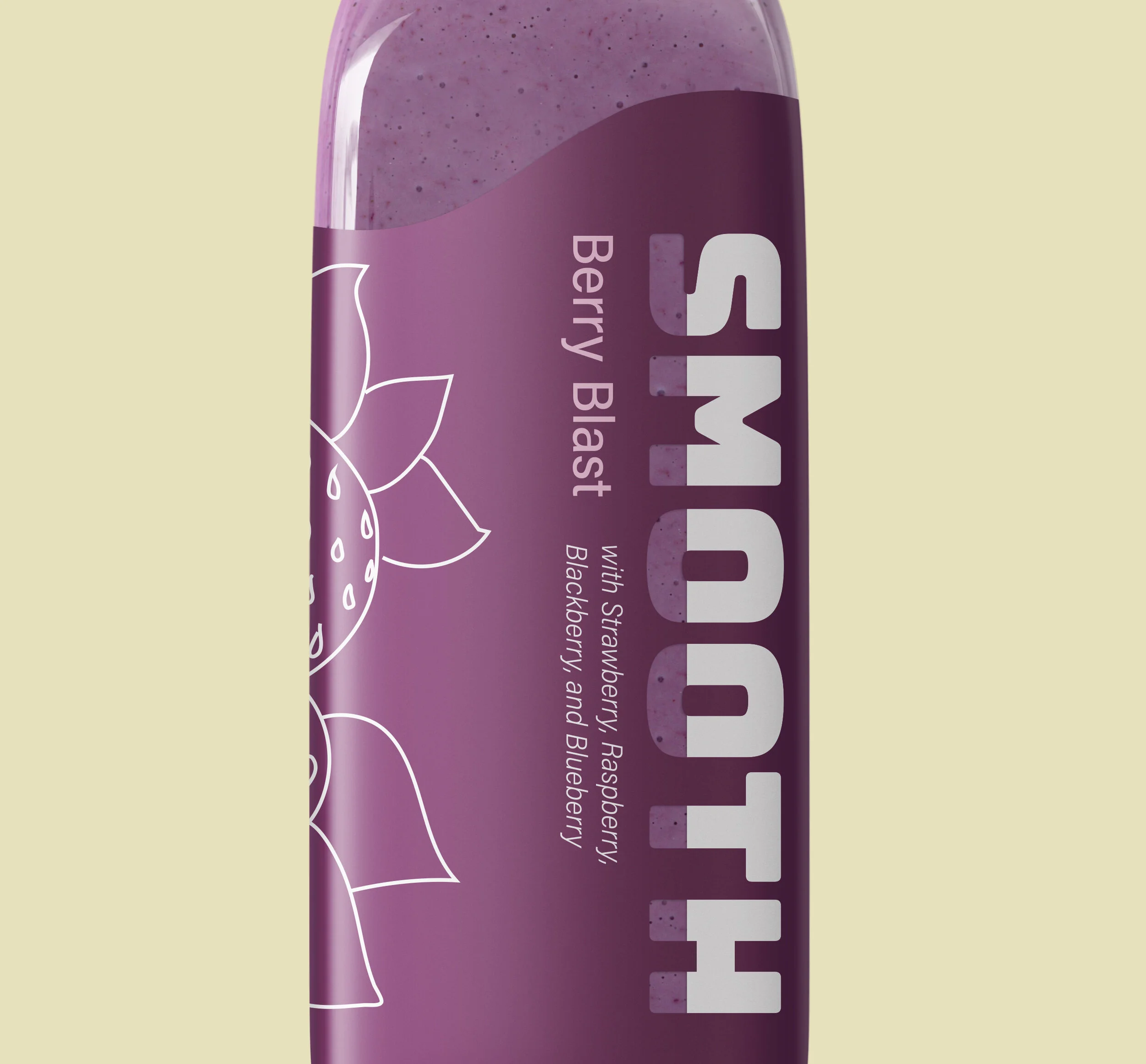
Inspired by a branding tactic used by the Coca-Cola Company, we started with the idea of Smooth being represented by a signature wave pattern. We came up with several iterations of this idea, but after discussion and feedback from others, we settled on using this wave as a way to bring novelty to the packaging. So, we stuck with the idea of the symmetrical wave for the top of the drink label.
Market trends
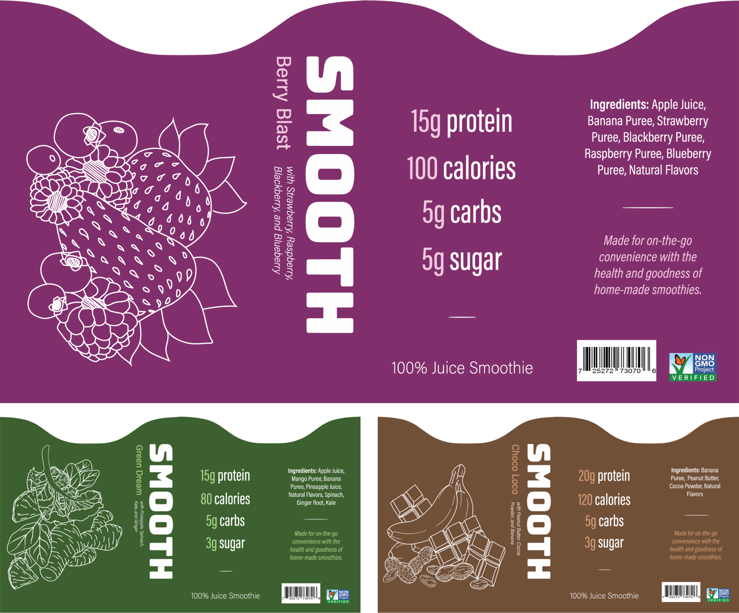
The current trends at the time indicated an increasing interest in drinks that had simple, easy-to-understand ingredients. Active individuals also took an additional interest in readily available nutrient information. Using this to our advantage to draw in the health-conscious consumer, our illustrations expanded to include every single ingredient in the drink.
Logotype detail
Our logotype gives our branding a playful air while also representing our brand values. Within 'Smooth’ on our label is a vertical line creating a cut-out, allowing the consumer to see the drink through the label. Smooth is a brand that is very transparent about its simple ingredients, so this design choice clearly reflects that full transparency in a unique way.
Wide appeal
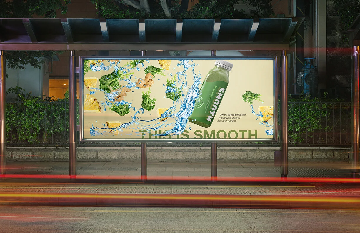
Three different flavors were created to appeal to a variety of people - offering variants between fruity blends, veggie-focused blends, and blends with a protein boost. Here are 2D renditions of our other two flavor labels. To keep the brand grounded in its natural ingredients as well as to resemble the popular aesthetic of juice companies, illustrations for each flavor were hand drawn by me and digitized for print.
Conclusion
The end result is an attractive, new smoothie brand targeting active millennials of all genders, creating a wide appeal for its products through a combination of successful visual language found both in pre-existing smoothie brands as well as pressed juice companies.
Final mock-ups shown with labels cut and applied by hand.
