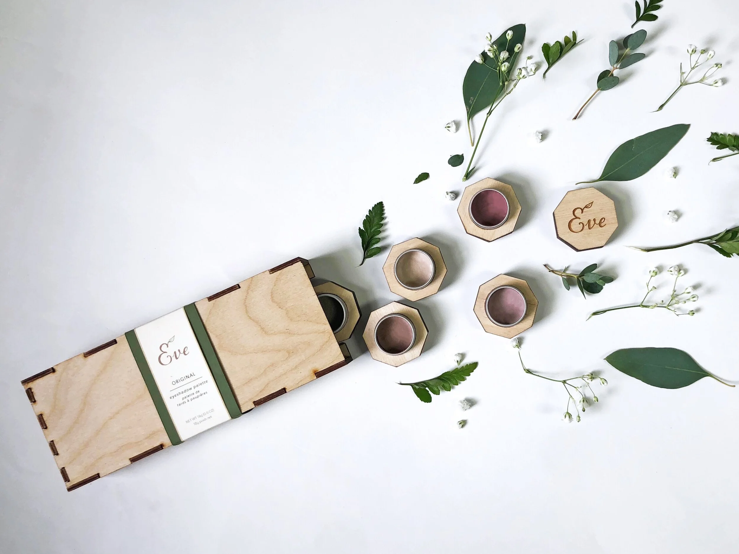
Eve: the Palette
Both package and product design was developed for an entirely new and unique identity in the cosmetic industry. Eve, unlike most cosmetic brands on the market, was created with sustainability at the forefront. We devised a one-of-a-kind solution that is fully sustainable with a modern twist on portability and customization.
All photography done by me and my partner. Physical prototype created with help from the Notre Dame IDEA Center.
Branding | Logo Design | Packaging Design | Industrial/Product Design | Photography | Art Direction

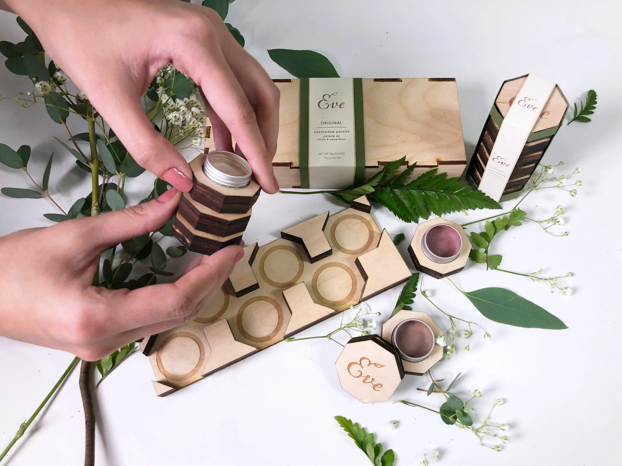
Feature Highlight: Portables

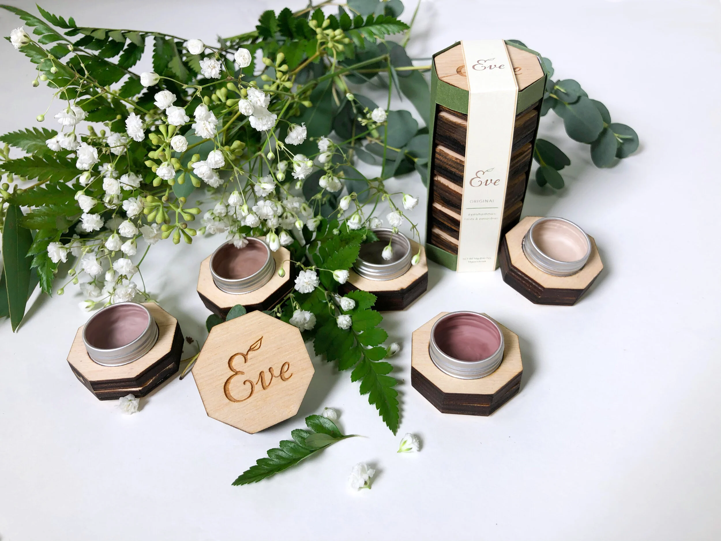
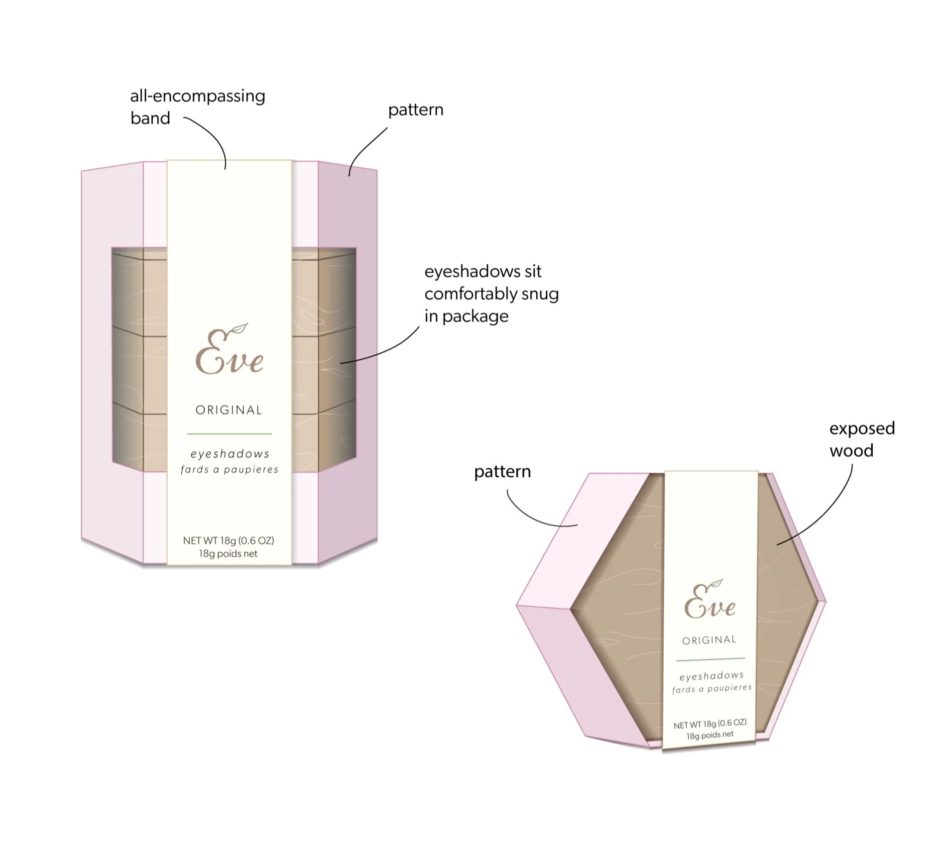
Each individual eyeshadow piece can be cleaned out and repurposed if desired. Otherwise, the portables can be completely deconstructed and recycled. On the left is our first test run of the product, with the right being the final product.
Case Study
Assignment: Design a new brand identity for your chosen industry - in our case, the cosmetic industry.
When thinking about key factors we’d like our product to exemplify, my partner and I immediately identified sustainability. This is something we both find increasingly important - particularly in an industry whose top competitors lack sustainable solutions.
Goals: Take a chic yet sustainable approach that targets millennials and gen Z.
Tactic: Generate an entirely new concept that distinguishes itself from other companies, stressing the sustainability factor.
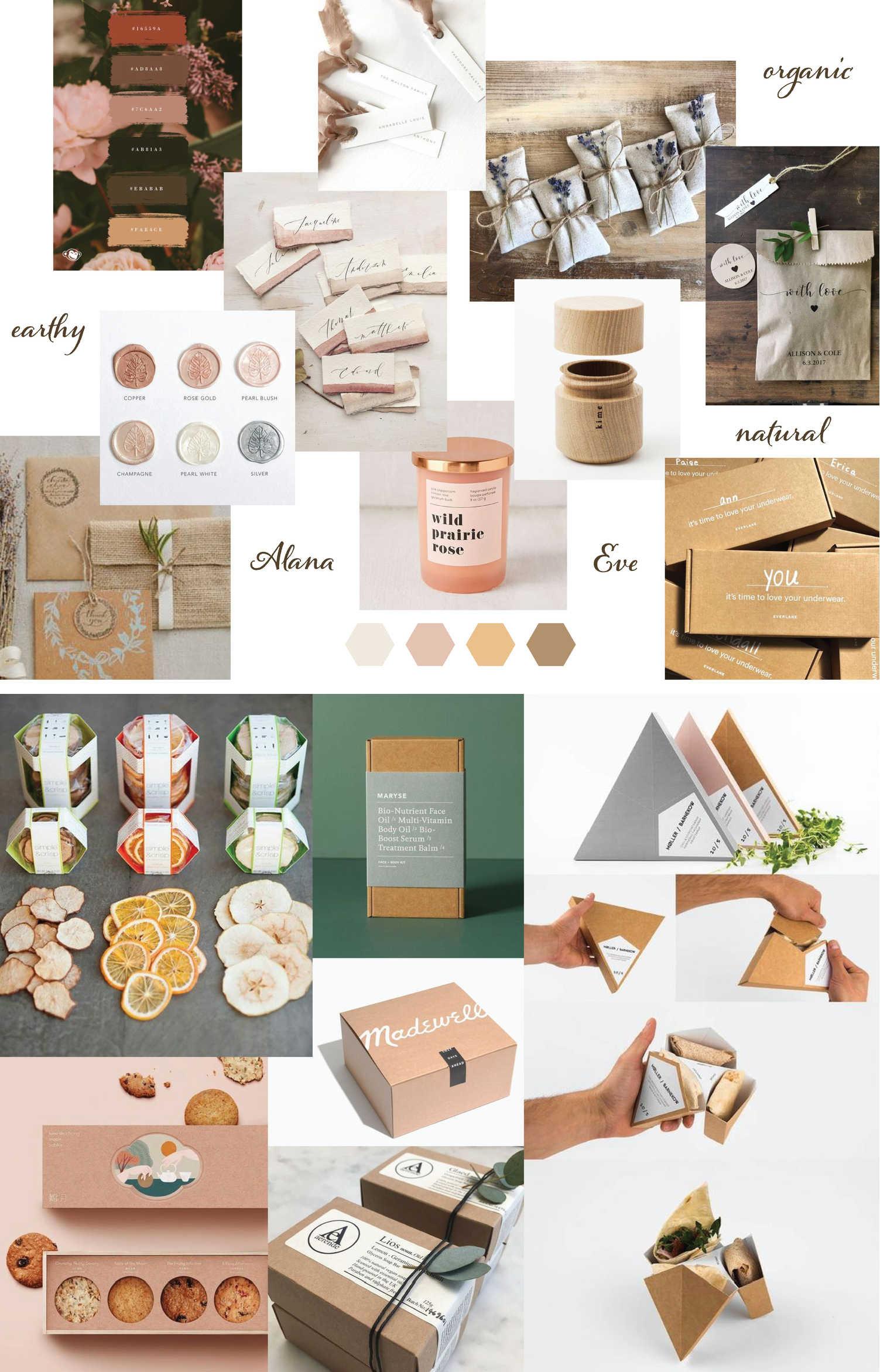
Moodboards & Inspiration
My partner and I each created several moodboards with a wide variety of aesthetics. Ultimately, we decided on one that embodies a very earthy yet feminine aesthetic.
Wanting a simple, sleek look, we took inspiration from recycled packaging as well as Japanese package design. We really dove into the sleek and innovative solutions some Japanese package designers have created, drawing heavily upon a dried fruit packaging created by the company Simple & Crisp.
Branding
For the logo, we chose the typeface Alana to reflect simple elegance. As for the name, ‘Eve’ reflects the notions of femininity, naturalness, and simplicity that will be represented in our final design solution. The soft pink neutrals chosen for the color palette reflect these same ideals.
Initial mock-ups
I created the initial mock-ups through traditional sketching, then transferred them onto Adobe Illustrator once a design was agreed upon. We began by focusing on the portables, as we went back and forth on whether or not we wanted to develop a palette tray to accompany the portables.
Palette tray
Further down the line, the palette tray was designed to complement the portables. When asked, our peers said they liked having a tray available in order to collect their eyeshadows together in a single piece - and thus the tray was created.
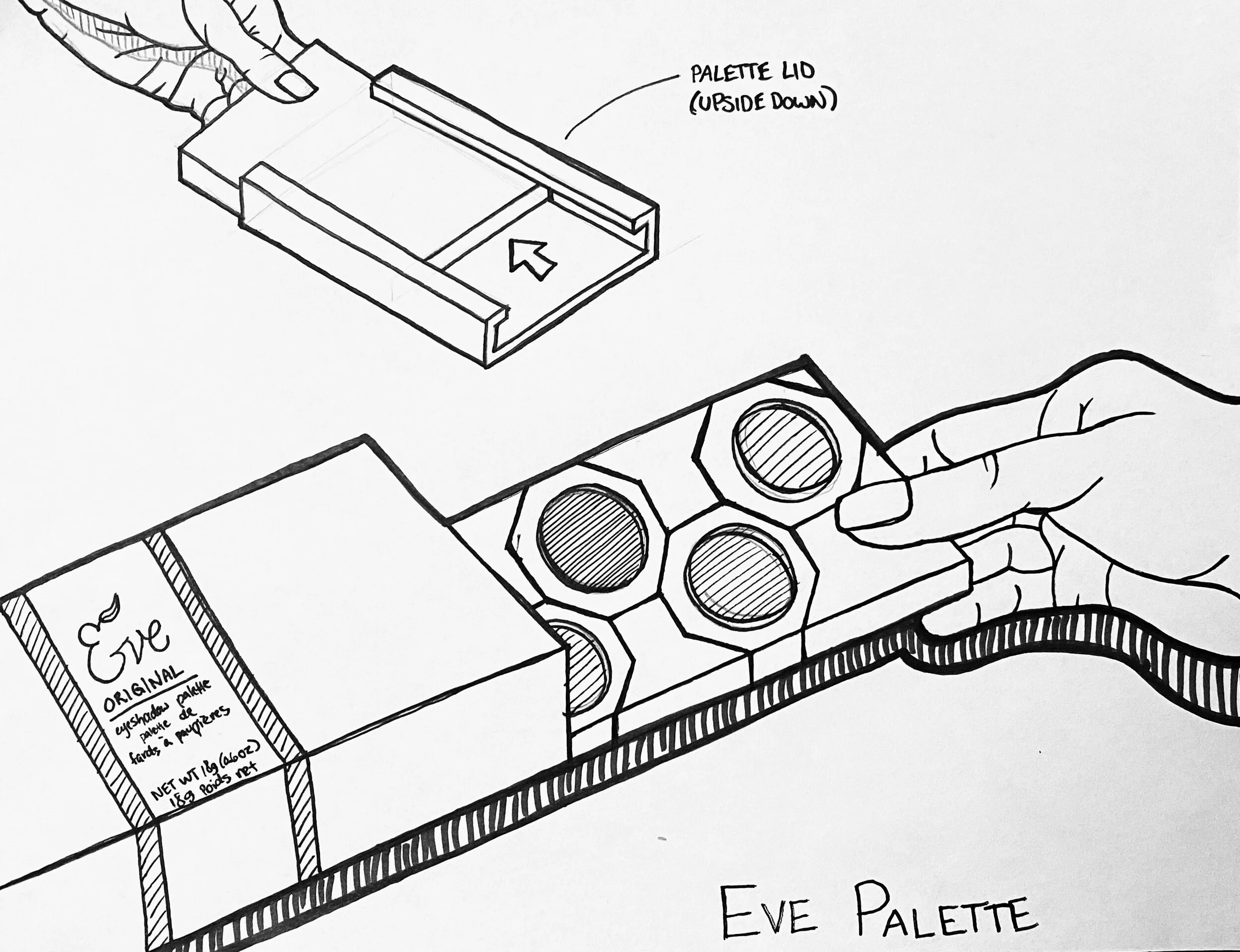
Palette tray detail
The original concept for the portables was hexagonal - taken from our package inspiration as well as the signature Fenty makeup branding. When developing the tray, however, we transitioned to an octagonal shape. This allowed for both a satisfying puzzle-piece organization as well as optimizing ease of placing or removing the individual eyeshadows.

Challenges
One of our biggest challenges was to figure out how to best enclose the palette so that it wouldn’t slide open when transported. We wanted the palette itself to be the point-of-purchase packaging in order to reduce unnecessary plastics and paper. After considering several options, we were able to create a sliding cover that was perfectly sized, keeping the palette in place unless pulled on. Shown below, the palette itself is a flat rectangle that slides out, allowing finger room for opening and closing the palette.
